

Most people are not afraid of color. They are afraid of choosing wrong — publicly, expensively, on four walls they then have to live with. So they paint everything greige, hang one patterned pillow as a hedge, and wonder why the room feels like a rental.
The irony is that timid rooms date faster than bold ones. A room that commits to something reads as a decision. A room that hedges reads as a room whose owner could not decide, and that never looks good in any decade.
Start with what you already own
The most reliable way to land on a color you will still like in a decade is to notice what you have been choosing for years without thinking about it. Asked by Martha Stewart how to pick a hue, that was our answer: “Look [at] what you already love—your wardrobe, a favorite bag, a piece of art—and pull from that palette so it feels like you, not just Pinterest”.
This is not a sentimental exercise. A color chosen because it is having a moment has a clock on it from the day it goes up. A color chosen because you have quietly gravitated to it for fifteen years does not.
Commit to the whole room
The accent wall is the hedge made visible. One wall in a color and three in something safe announces that somebody got nervous halfway through, and it chops a room into pieces rather than giving it a mood.
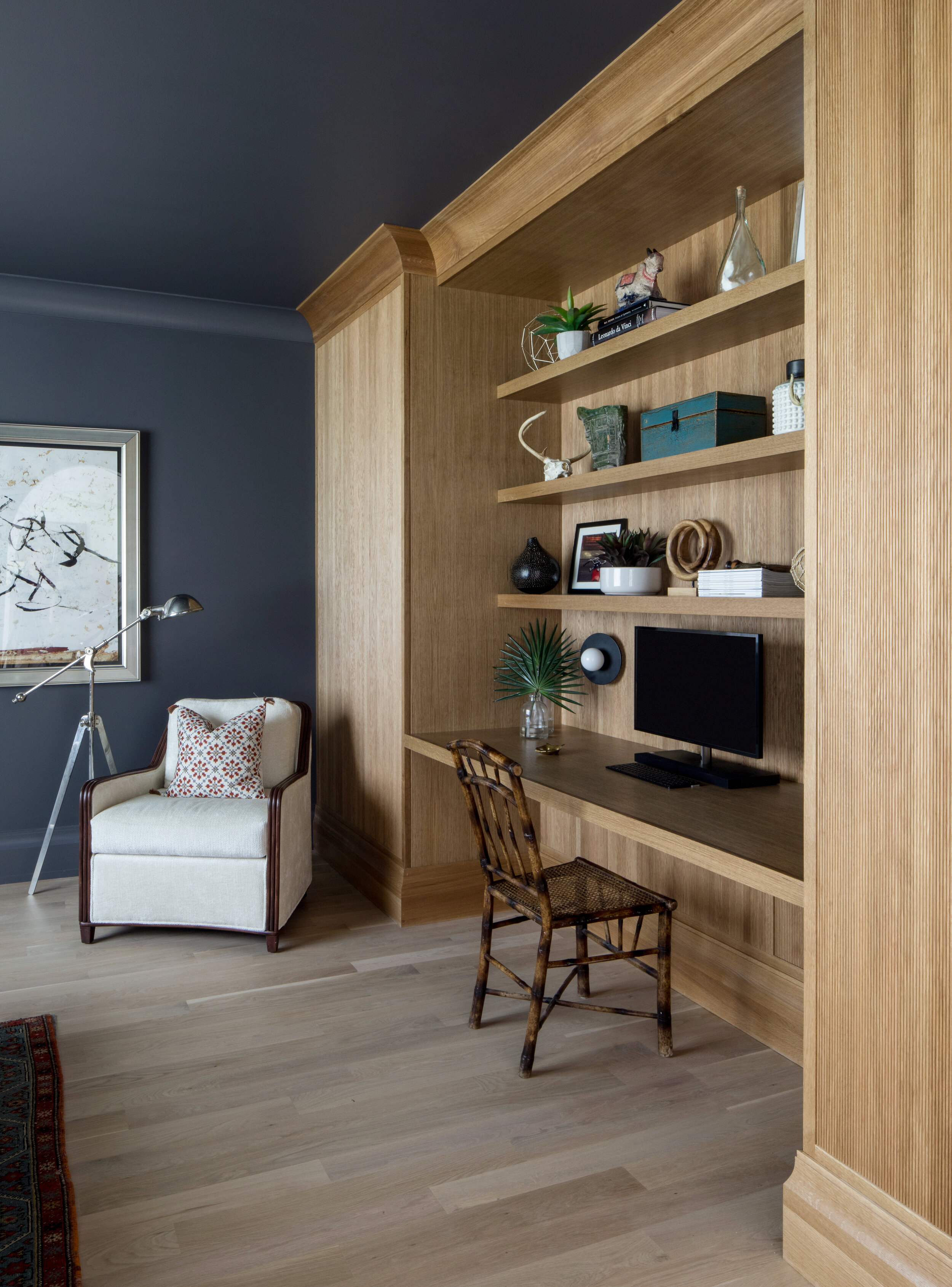
What works instead is taking the color everywhere — walls, trim, ceiling, doors, casings, built-ins. It sounds like more risk and it is actually less, because the room stops reading as a wall with paint on it and starts reading as an atmosphere. As we put it to Martha Stewart, color drenching “hides visual clutter, lets the architecture shine, and creates an instant mood.”
It is also not a trend in the way people assume. “We’ve seen this in fashion as well—monochromatic dressing reads chic and pulled together, never flashy”. That is the whole argument for its longevity: it is a structural idea rather than a seasonal one.
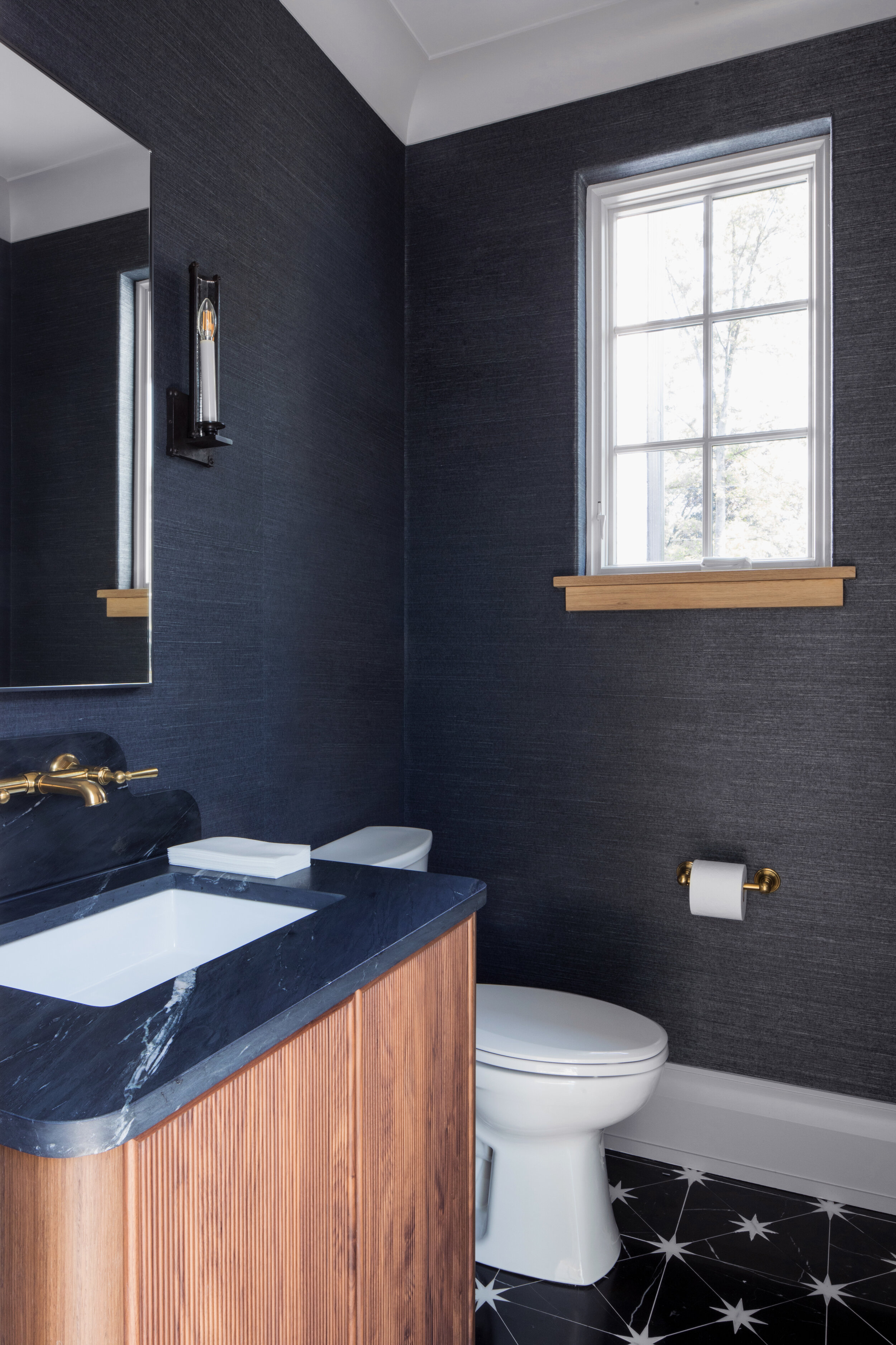
Two practical notes we gave the same piece. On finish: “Matte walls [and ceilings] paired with slightly glossier trim or accents introduce subtle depth, without disrupting the color story”. And on completeness: “Don’t forget doors, baseboards, window casings, built-ins, and sometimes even radiators or vent covers”. A drenched room with a white radiator in it is a drenched room with an unfinished corner.
The undertone is the real decision
People agonize over the color and ignore the undertone, which is the thing that actually determines whether the room works. Ask one question before anything else: is it warm or cool? That answer should then drive every other selection in the room — the fabrics, the metals, the stone.
Get the undertone right and a surprisingly strong color behaves itself. Get it wrong and even a cautious color fights the floor, the counter and the light all day.
Powder rooms and studies first
If you are not ready to drench the family room, do not start there. The best rooms to be brave in are the ones you pass through or retreat into — a powder room, a study, a bar, a laundry. They are small, they are contained, they are cheap to repaint, and they are the rooms where a bold decision is delightful rather than exhausting.
There is a second reason, which is that these rooms usually have no natural light to protect. The less daylight a room gets, the deeper you can go, because saturated color barely changes in low light while pale color goes flat and gray.
Pattern is a question of scale, not quantity
The rule that makes pattern mixing work is almost embarrassingly simple: vary the scale. One large pattern, one medium, one small, in a shared palette. A big mural or a wide stripe, a mid-size floral or check, a fine texture that reads almost solid from across the room.
What fails is two patterns at the same scale competing, or four patterns with nothing in common. What holds a mix together is not matching — it is a repeated color and a difference in size.
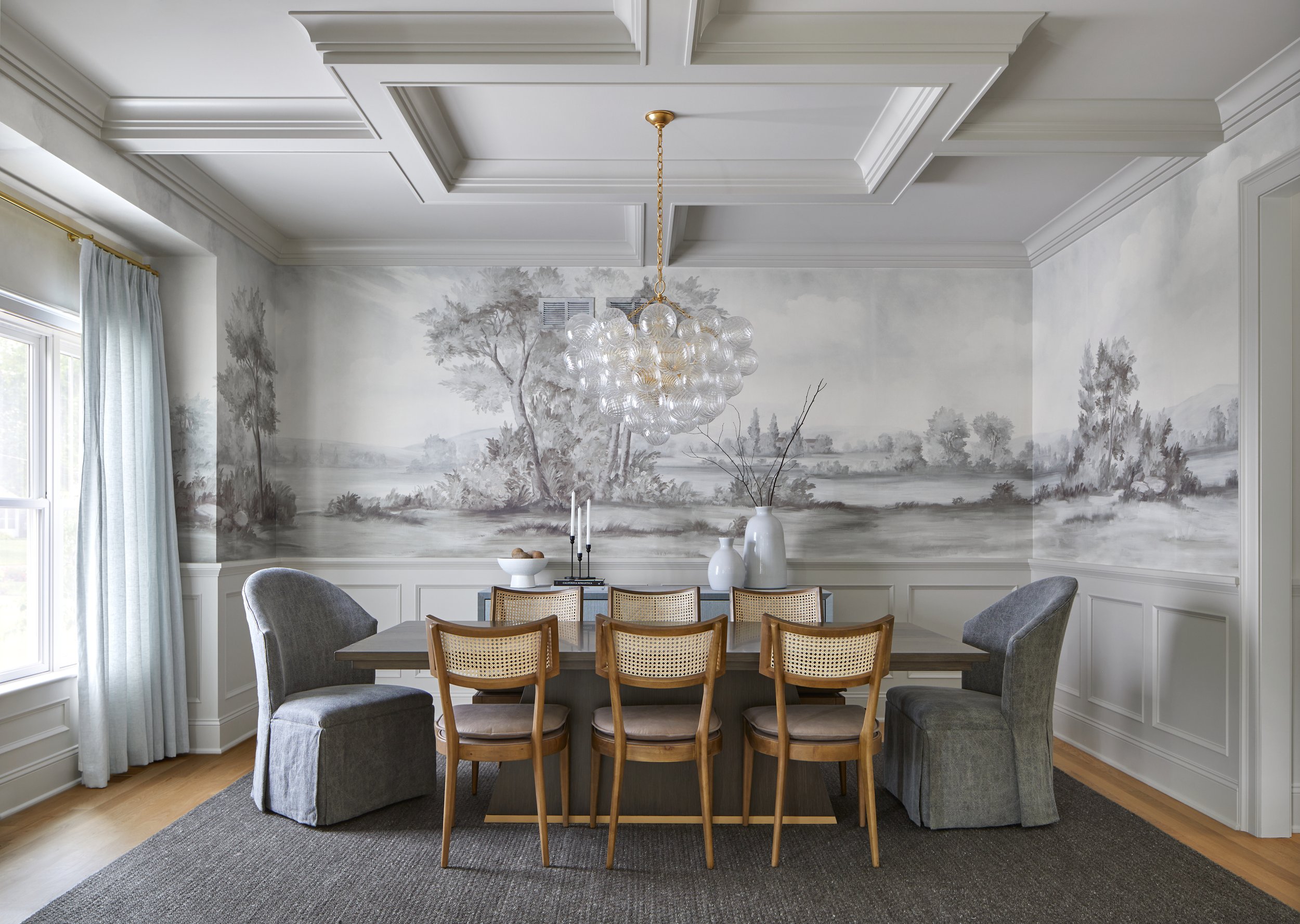
A mural is the largest-scale move available and one of the most timeless, because it behaves like art rather than like decorating. The hand-painted one above wraps a dining room in Chatham. Put it in a room with quiet furniture and let it be the only thing talking.
Let one thing be the loudest
Every room that works has a hierarchy. Something is the star and everything else is supporting. When the wallpaper is doing the work, the chairs go quiet. When the sofa is emerald, the walls step back.
Rooms go wrong when three elements all insist on being looked at first. That is usually what people mean when they say a space feels busy — not too much color, but too little agreement about where the eye should land.
Put color on things that are not walls
Paint is the cheapest way in, but it is not the only one, and some of the most durable color in a house is on the cabinetry. A sage kitchen in Westfield or a navy mudroom carries color at architectural scale, ages like joinery rather than like a trend, and gives the rest of the room permission to stay calm.
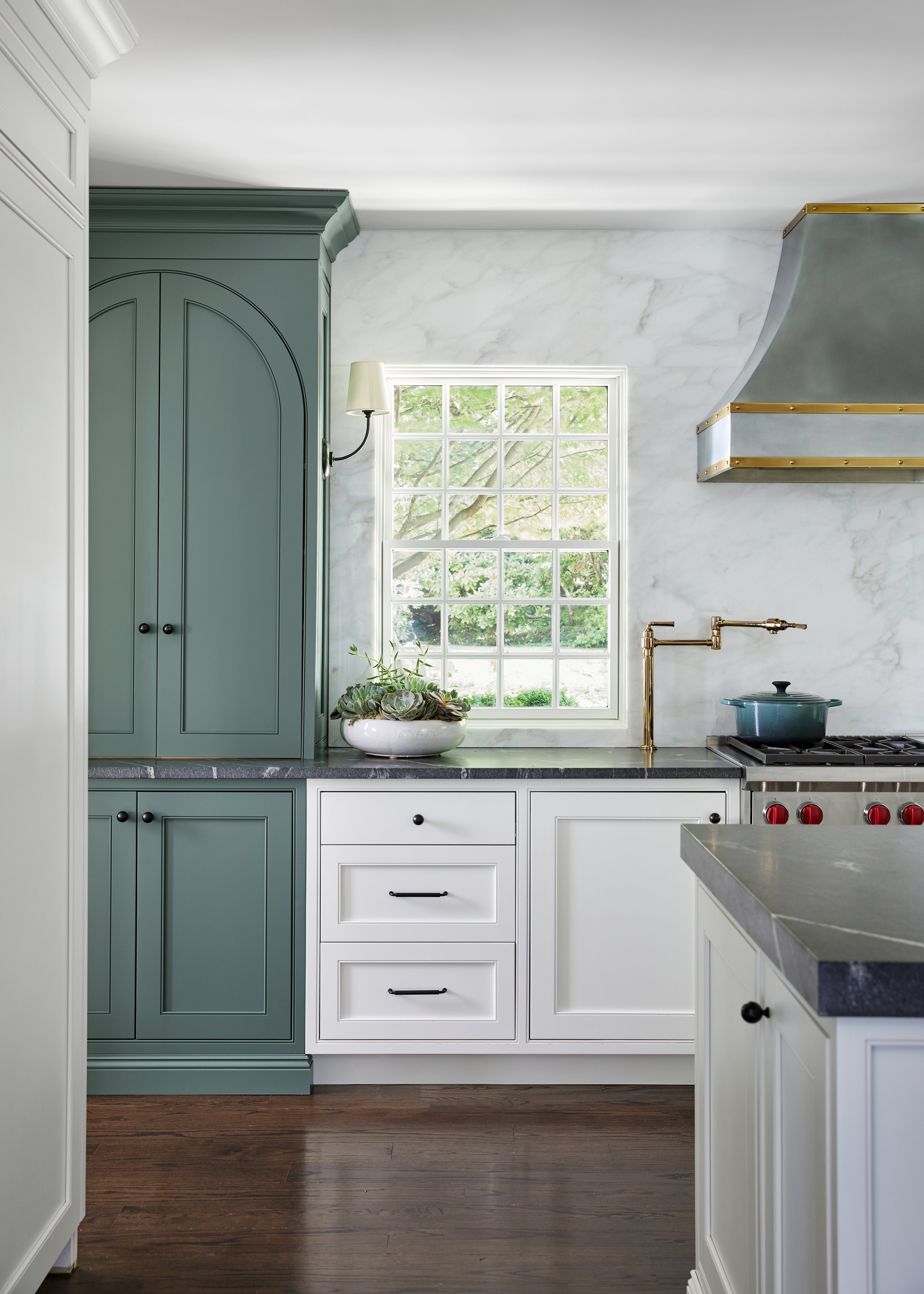
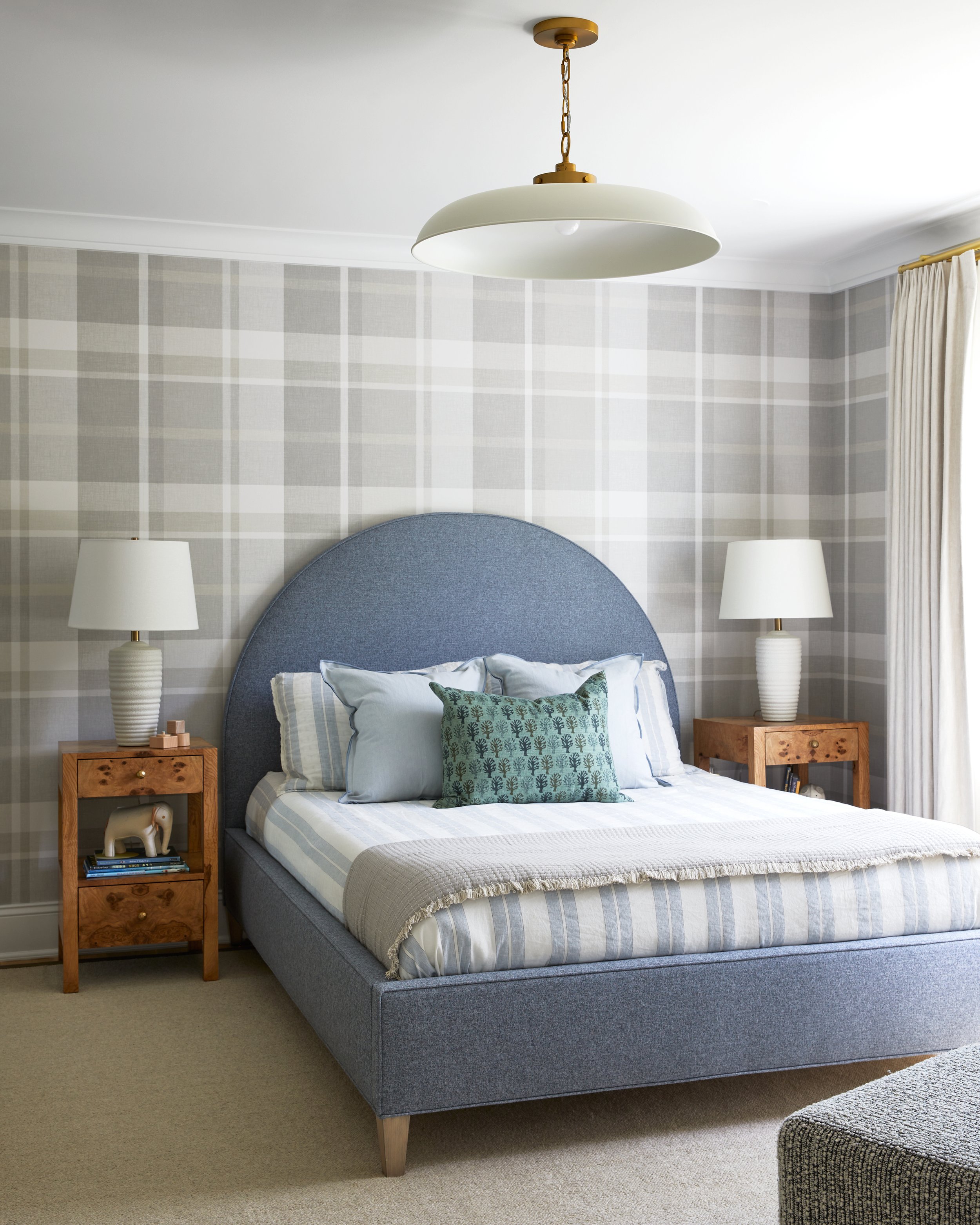
The same logic applies to a rug, a tiled floor, an upholstered headboard or a run of drapery. Color carried by a material tends to outlast color carried by a coat of paint, because it was chosen for the material first.
What actually makes color look dated
Not boldness. Three other things.
- Chasing a named shade. Anything marketed as the color of the year arrives pre-dated, because everyone is doing it at once and everyone will stop at once.
- Matching. A pillow that matches the rug that matches the art reads like a showroom set. Relating is not matching — a shared undertone does far more than a shared color.
- Applying it thinly. One wall, one pillow, one stripe of hesitation. Under-commitment is what looks tentative in photographs five years later, not the color itself.
How to do it with confidence
Confidence here is a process, not a personality trait. Sample large — not a chip, a proper painted board you can move around the room and look at in morning light, in lamplight, and at nine at night. Test it on the ceiling too, because that is where people get surprised. Hold it against the things that are not changing: the floor, the counter, the stone.
Then decide, and stop looking. The most common failure we see is not a bad color. It is six weeks of swatches, a compromise nobody wanted, and a room that reads as exactly that.
One more thing worth saying: a color-drenched room should relate to what is on either side of it. As we told Martha Stewart, it “should feel like a deliberate moment, not a random interjection”.
Where this lands
Timeless does not mean neutral. It means the color is yours, the room commits to it, the undertone agrees with the materials, and one thing is clearly the loudest. Do that and a strong room stays right for a decade. Hedge and a quiet room looks tired in three.
More on how the layers come together in making a home feel collected, not decorated, or see how it resolves across whole homes in our projects. If you would like help choosing, start a project — and bring the thing you have loved for fifteen years.