

Two names come up more than any others when a new client tries to describe what they want. Ralph Lauren. Nancy Meyers. Usually in the same breath, usually with a slightly apologetic laugh, usually followed by “you know what I mean?”
We do know what you mean. And it is a genuinely useful place to start, because those two references are shorthand for something real — two different answers to the same question, which is how a house should make you feel when you walk into it.
What people mean when they say Ralph Lauren
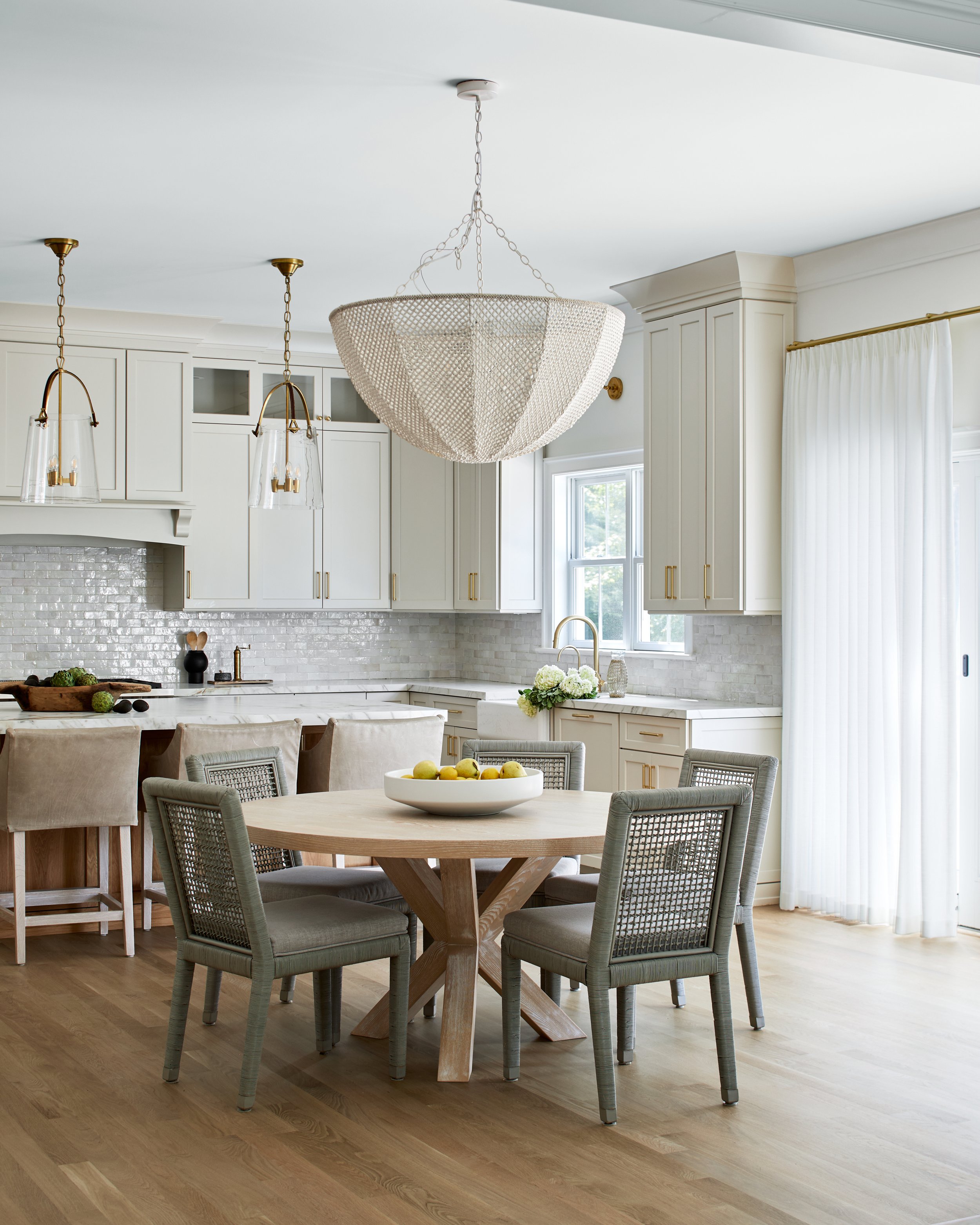
They mean a room with a history it may or may not have earned. Leather that has gone soft at the arms, brass that has stopped being shiny, dark wood, a wall of books that look read, a plaid somewhere, a bar that means it. Lamplight instead of overhead light. The sense that someone's grandfather might be in the next room and would have strong opinions about your drink.
The useful lesson underneath the mood board is layering and patina. That look is built out of materials that improve as they age rather than degrade — leather, wool, unlacquered brass, oiled wood — and out of rooms that are not afraid of being dark. Which is the part most people flinch at. One properly dark room in a house makes every other room feel brighter, and it is almost always the room everyone ends up in.
What people mean when they say Nancy Meyers
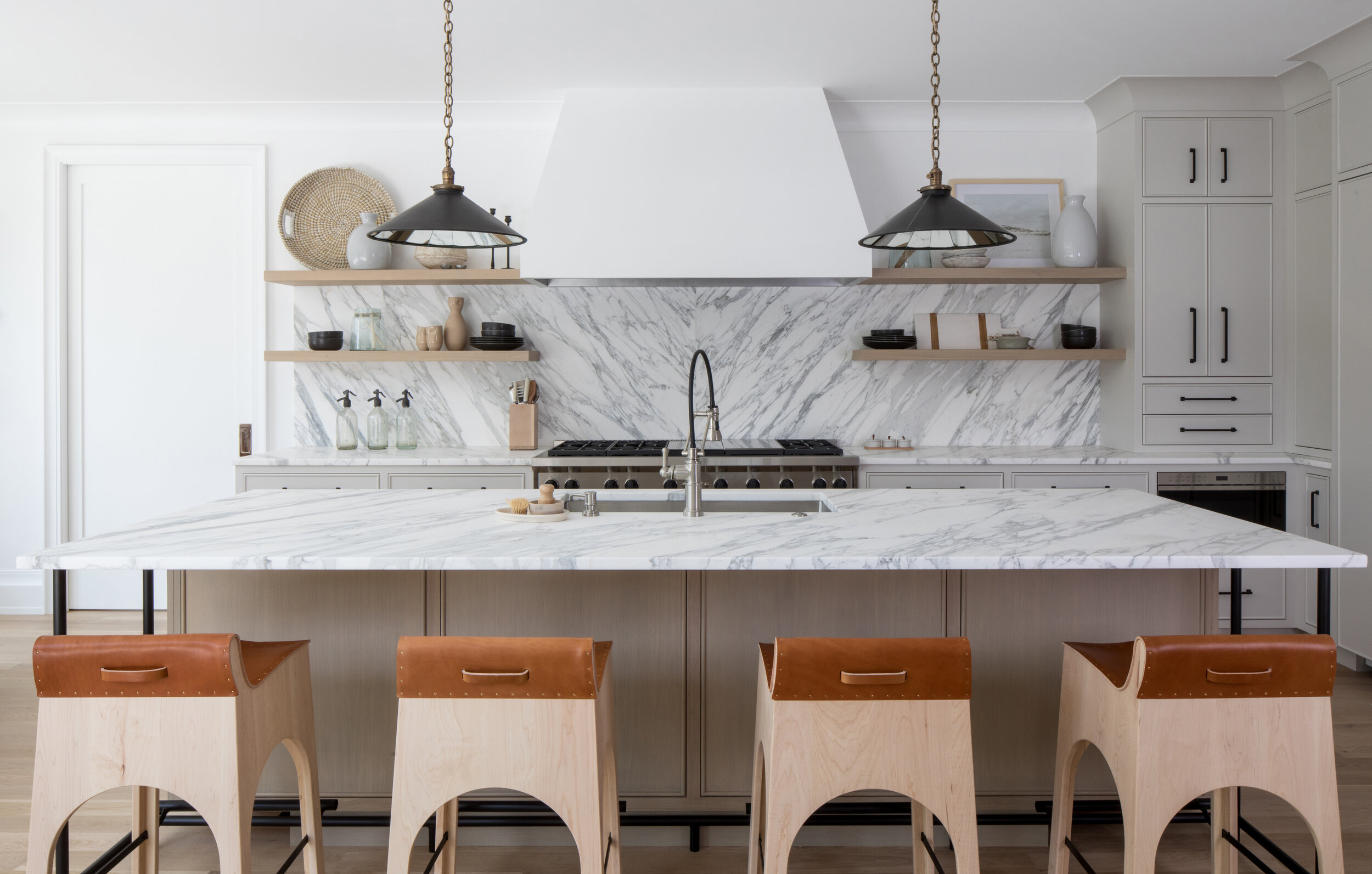
They mean the kitchen. Everyone means the kitchen. Cream cabinetry, marble that goes on forever, a pot of something on the range, enormous windows, slipcovered seating that looks like you are allowed to sit on it, and a general sense that someone in this house bakes and also has a very good life.
The lesson there is light and generosity. Those rooms are not actually about the color white — they are about scale and comfort. Seating deep enough to fall asleep on. An island big enough that people gather at it without being asked. Nothing fussy, nothing roped off, everything soft. It is a fantasy about hospitality more than a fantasy about decorating.
The interesting part is where they agree
Here is what nobody notices: these two references want most of the same things.
Neither is minimal. Neither is precious — you are meant to sit down, put a glass down, live there. Both are built on natural materials that age visibly. Both assume a house is for people rather than for photographs, and both are, in their own way, deeply nostalgic about a home being a place where everyone gathers.
They differ on exactly two things: how much light and how much pattern. That is the whole argument. Everything else is agreement, which is why the two references sit together so comfortably in one sentence and why nobody who says them together feels they are contradicting themselves.
Nobody actually wants either one
And then we start designing, and something reliably happens: the client turns out not to want a Ralph Lauren house or a Nancy Meyers house. They want their house, and those two names were just the nearest available words.
The references get us in the room. What decides the project is the specific, unglamorous, entirely personal stuff — that you have three dogs, that your mother-in-law stays for two weeks every summer, that you cannot sleep if there is any light at all, that you inherited a piano nobody plays but nobody is giving away. That is where a house actually comes from.
Our job is to bring the point of view and then let you pull us off it. We have opinions about proportion, material and light, and that is most of what you are hiring. But the aesthetic is yours, and the good projects are the ones where the client argued with us about something and turned out to be right.
Where our clients have actually landed
The best evidence is that no two of these look alike.
In Casacquasanta, a new home with modern California lines and Spanish notes, the kitchen is marble and light — and then you walk into the pub, which has a pressed tin ceiling, a dark bar and the warmest lamplight in the house. On paper those two rooms should not belong to the same family. In practice they belong to this family, who wanted somewhere bright to cook and somewhere moody to end the night.
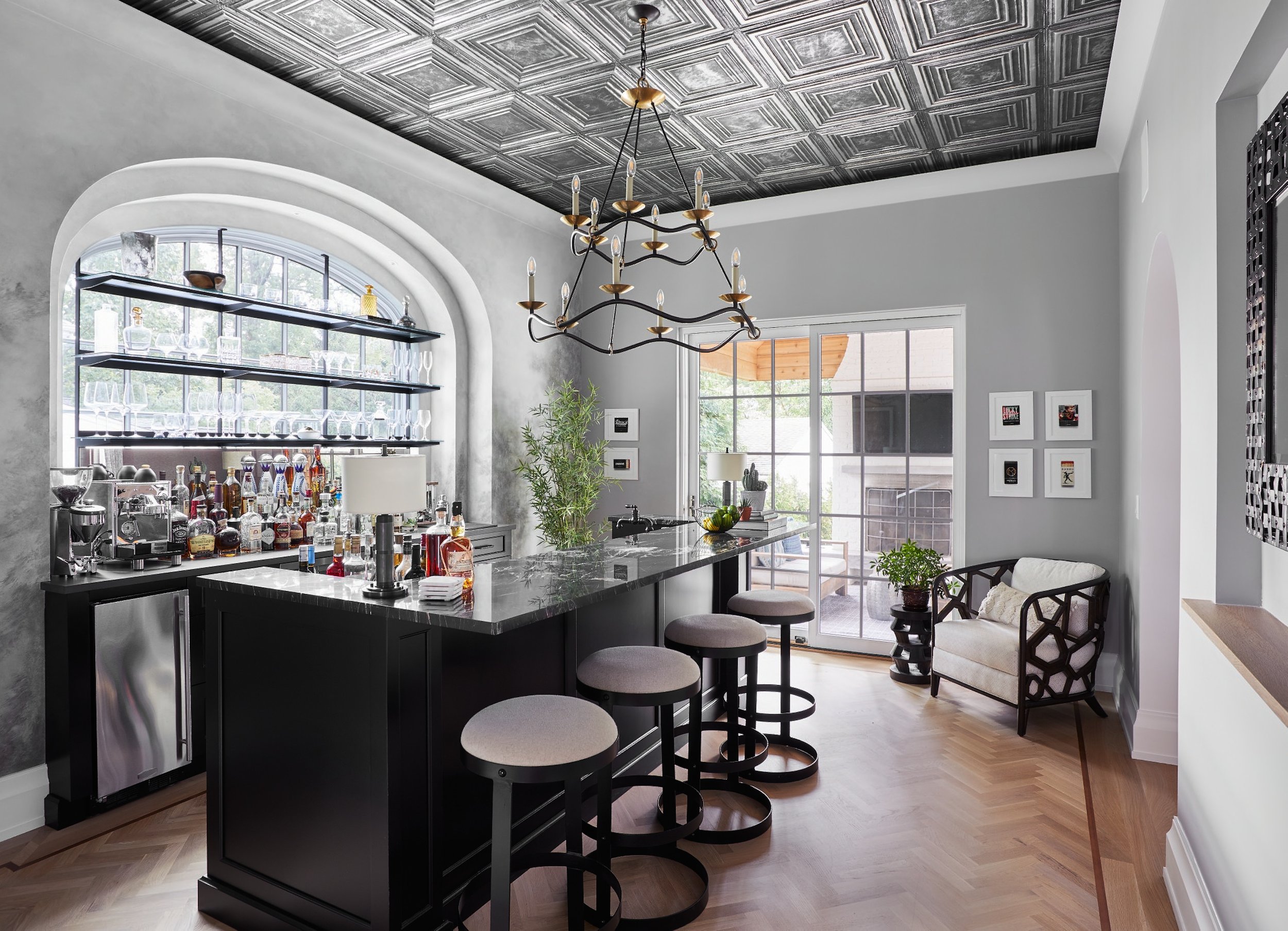
In Bricks and Stones, a 1929 stone-and-shingle house in Westfield, the kitchen went sage green with a soapstone island and cane-back stools. Warmer than the cream fantasy, quieter than the leather-and-brass one, and exactly right for a house of that age.
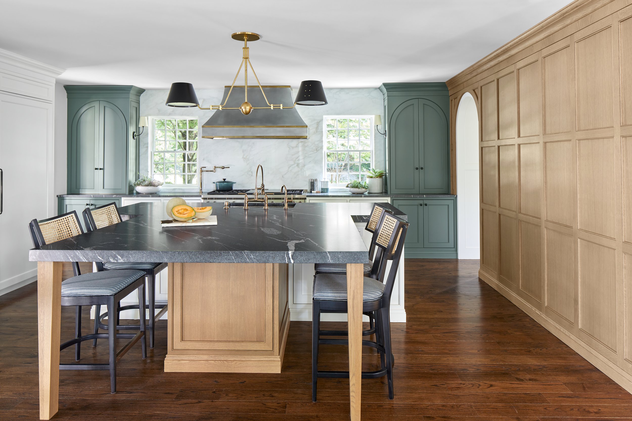
In Chatham Charm, a newly built house furnished room by room, the kitchen is the bright, beaded-chandelier version — the closest any of our projects comes to the reference, and it got there because that family genuinely lives in the light.
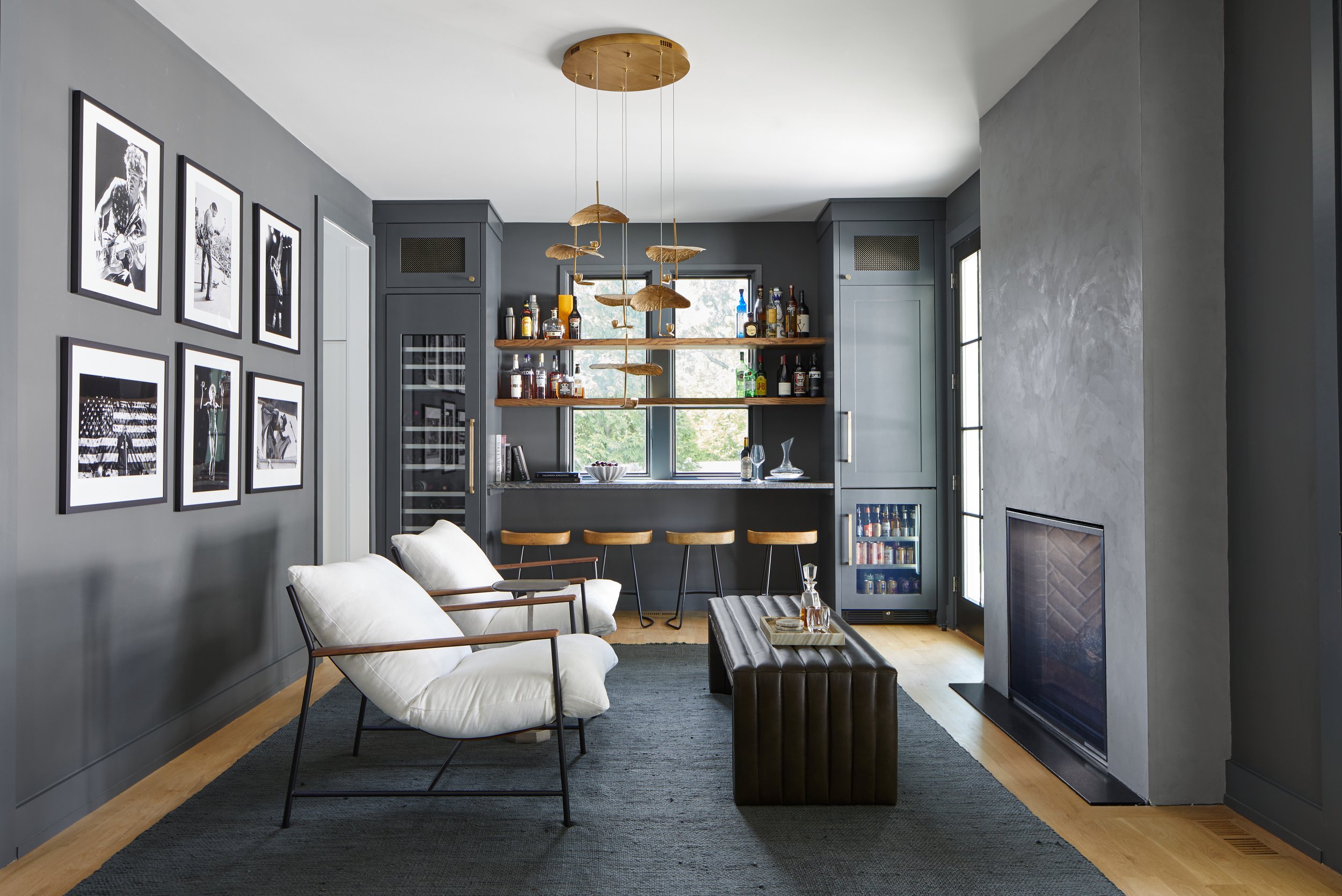
And in Raise the Ranch, the lounge went moody, with a gallery wall, custom shelving and a brass pendant — a ranch house with a room in it that feels like a club.
How we find your version of it
Bring the references. All of them, including the ones you think are embarrassing, and especially the pictures you have saved without knowing why. Contradictory is fine — contradictory is actually the most useful thing you can give us, because the tension between two images you love is where your taste is hiding.
Then we put real options in front of you and watch what you react to. People are far better at knowing what they want when they see it than at describing it in advance, which is why we never ask anyone to arrive with the answer. You will end up somewhere more specific than either name, and it will be better than both, because neither Ralph Lauren nor Nancy Meyers has ever met your dog.
So, what is it about?
It is about a house that looks like it has been loved for a while. Warm materials, real light, nothing you are afraid to touch, one room that is darker than the rest, and enough seating that nobody has to perch.
Start with the references. End up somewhere that is yours.
See how it resolves across whole homes in our projects, room by room in the photo galleries, or read the companion piece on making a home feel collected, not decorated. When you are ready, start a project and bring the embarrassing references.